Credible Offer Dashboard Redesign
Led the redesign of Credible's co-signing experience for student loan refinancing, including user flow, interaction design and visual design for both desktop and mobile.
Problem
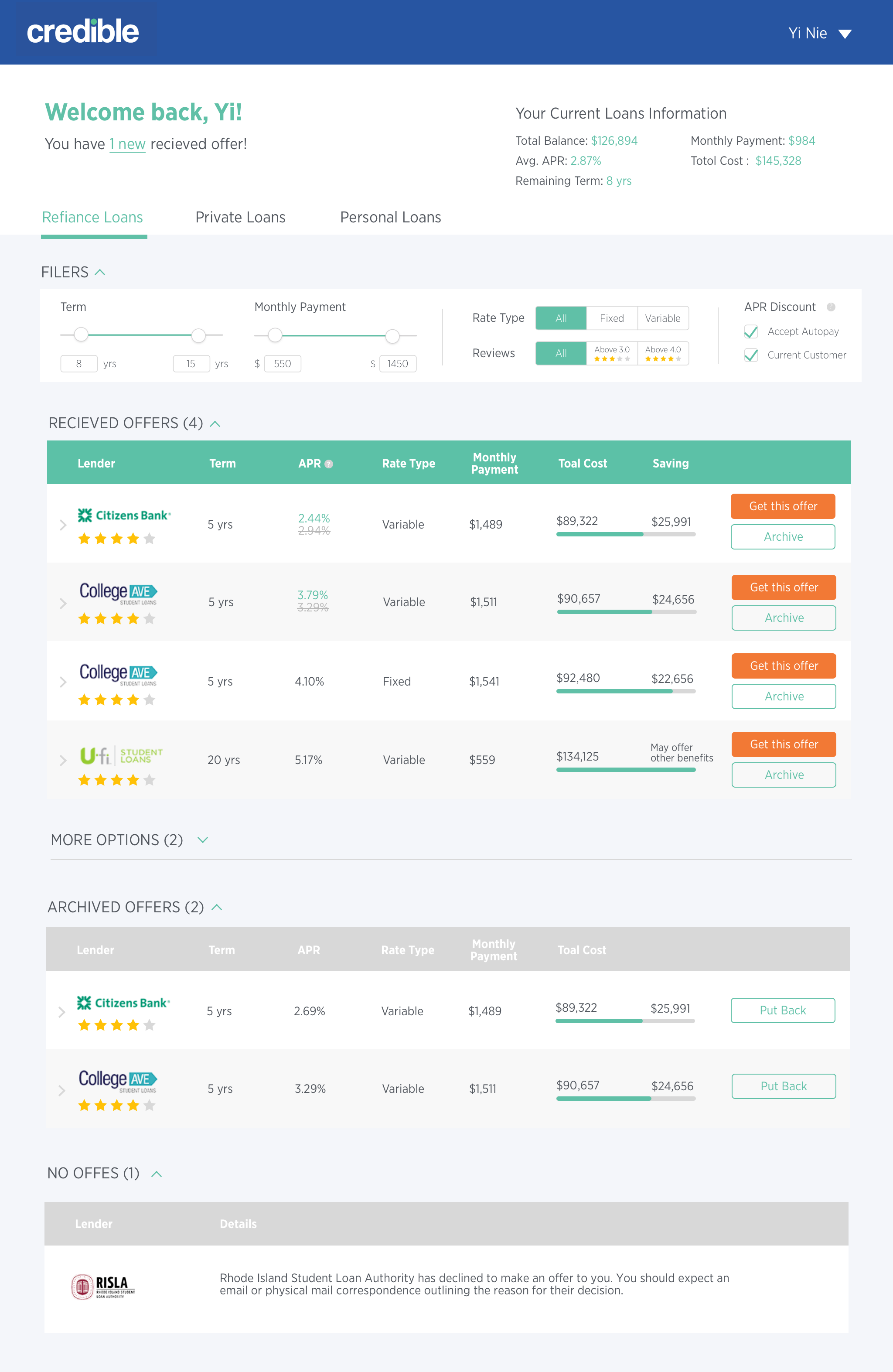
Credible is a marketplace for student loan refinancing. It helps borrowers get personalized rates from multiple lenders. It's great that users can receive multiple offers by providing data once. But the terms and benefits of each offer are very different. How to design the offer dashboard to help users find the best offer?
User Research
In order to better meet users' needs, it's important to understand how do people make their choice among several options. I conducted user interviews to gather insights about the process of choosing a product and factors influence decision making.
Need current loan information for reference
For student loan refinancing users, they have very a clear goal that the refinancing offer should offer more benefit than their current loan. So users need their current loan information for reference.
The refinancing offer should be better than my current loan
Filter the options with fixed criteria in mind
Before choosing the product, people usually have fixed criteria in mind. For example, their income situation will determine the maximum monthly payment. Some users are clear that they don't want to choose variable rate because they don't want to take the risk of APR getting higher.
I can only pay up to $600 a month
Eliminate options that users are not interested in
For users who are shopping around, they really want to make sure they choose the best option. But it's quite difficult to find the best at once. Users prefer to eliminate options that they are not interested in and finally get to their favorite one.
I can't tell what I want right now but I know what I don't
Solutions
Design goals and key consideration

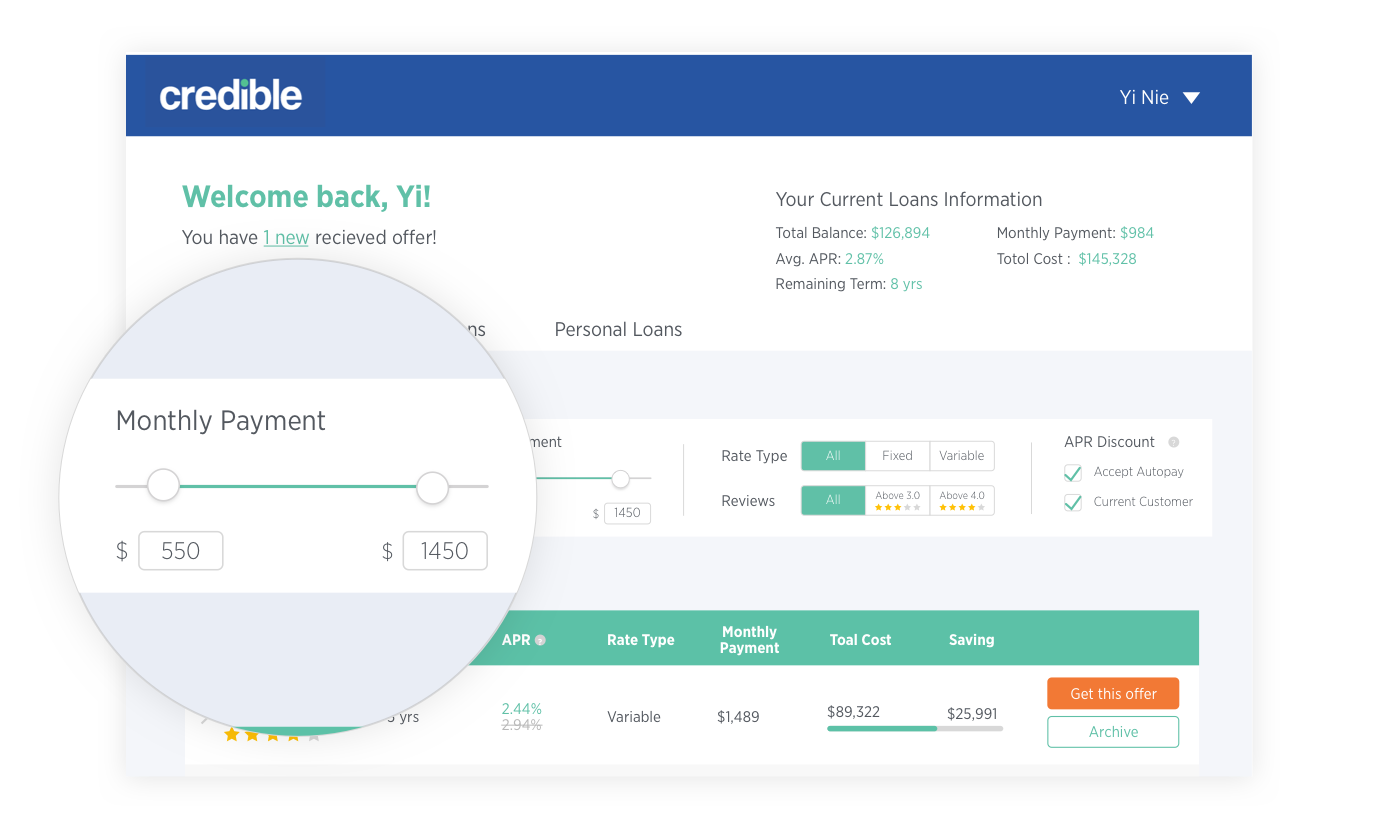
Include current loan information

Improve usability of filters
Archive options not interested
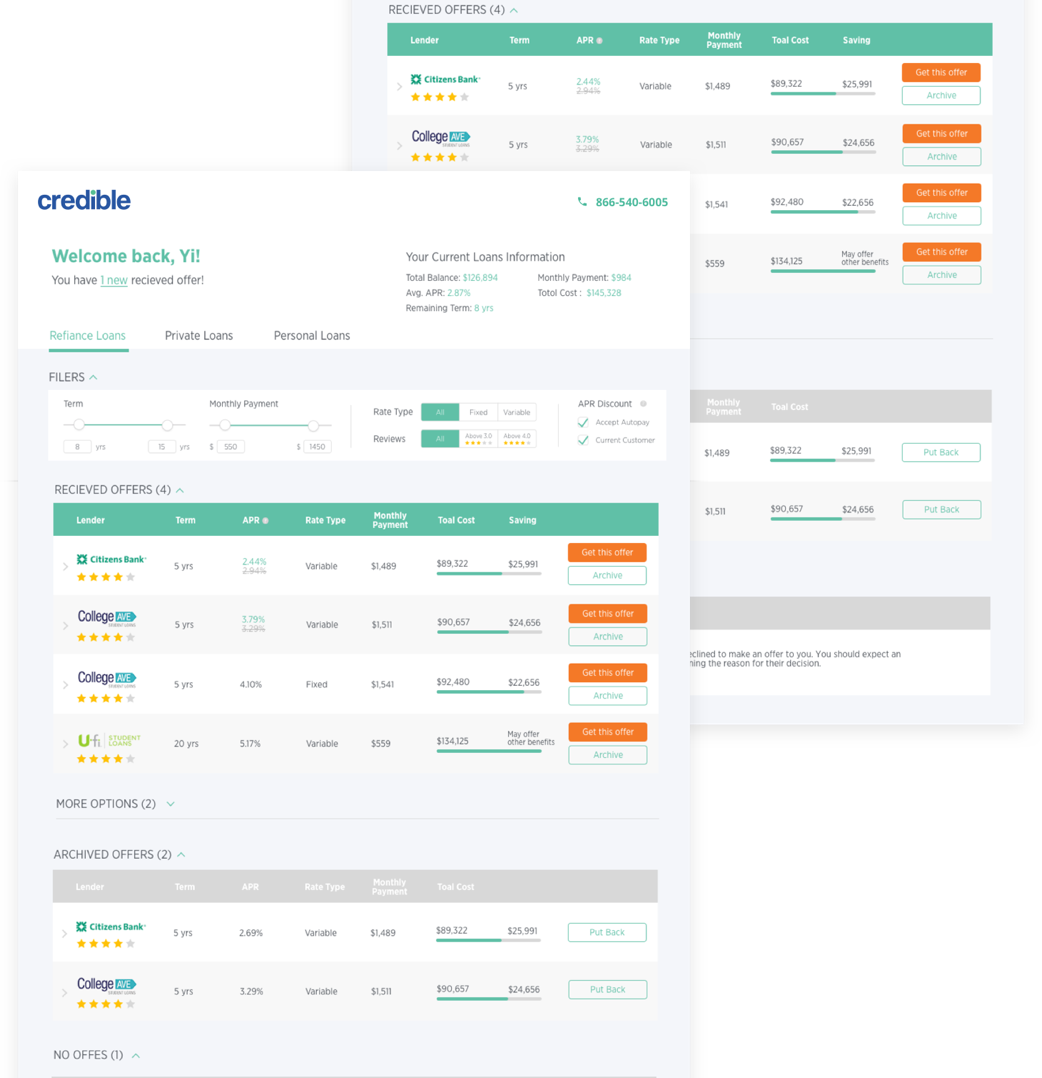
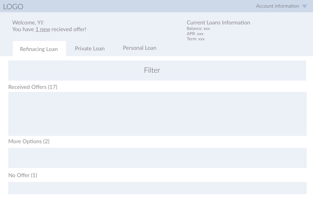
1. Include current loan information
What is the page structure?
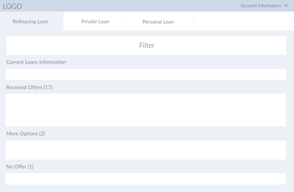
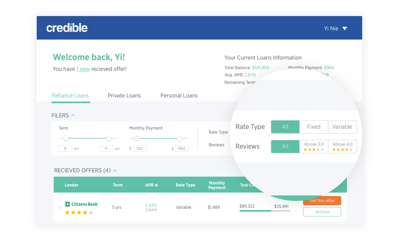
Structure and information architecture of the offer dashboard really affects how users process the information and where should current loan information live? So I decide to think about the how the page is structured instead of figuring out all the details of design at one time. I took these questions into consideration to make sure users can understand and navigate through dashboard easily.
- Use tab structure for different loan type navigation
- Put filter above offers instead of on the left side
- Show new updates of the dashboard and current loan information on top

1st iteration
2nd iteration
3rd iteration
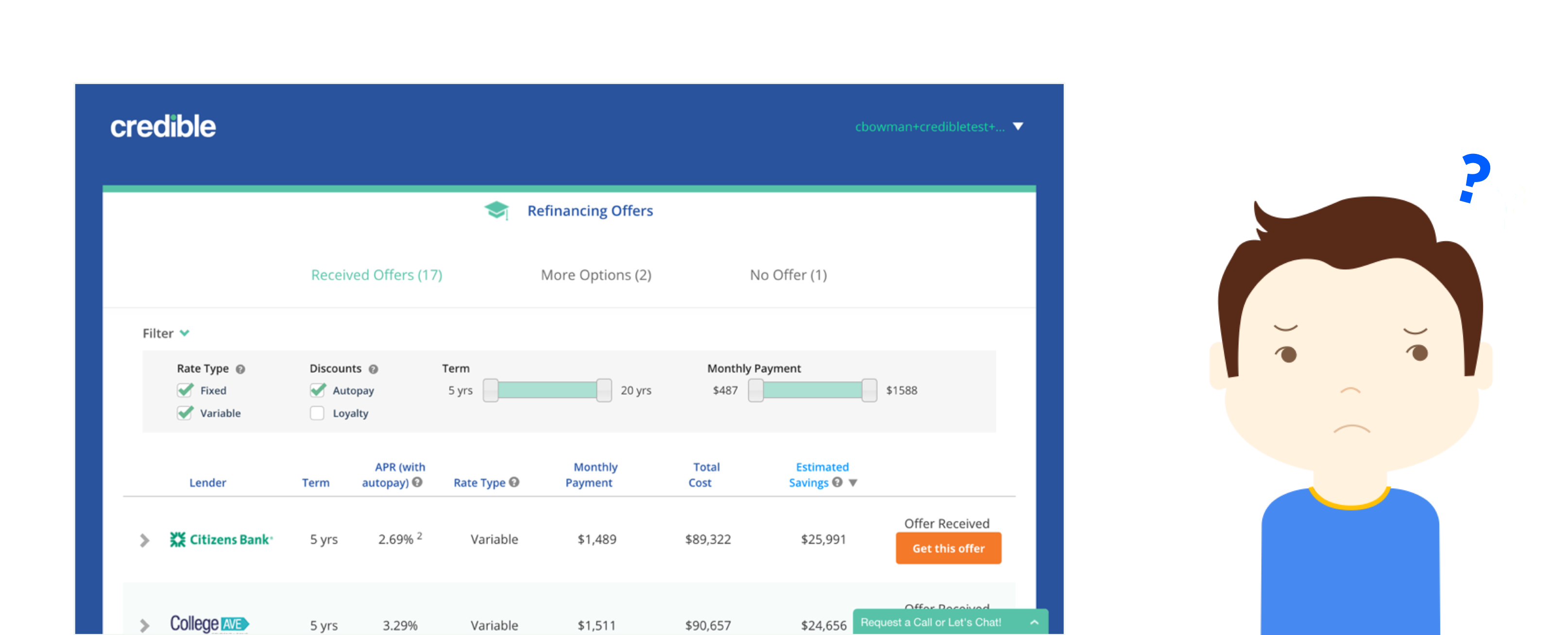
2. Improve filter usability
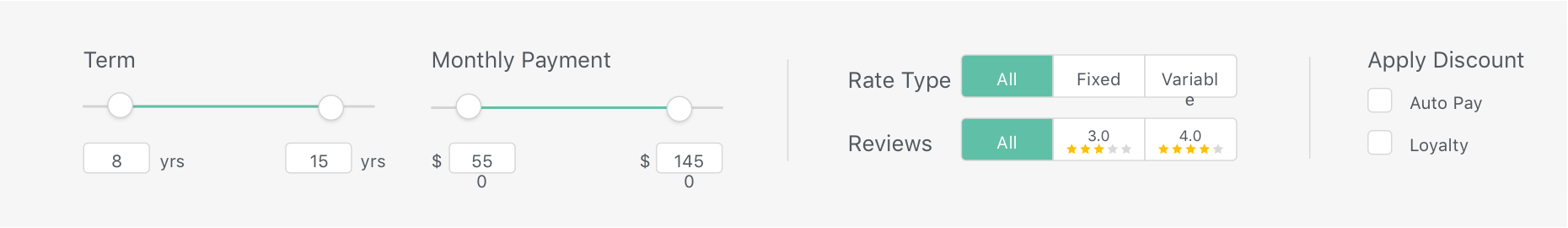
Slider v.s. input
The sliders provide a clear visual cue of what it is and how to use it. However, adjusting the sliders to a specific number can be a difficult task. So I decide to keep the slider pattern but also give users the ability to type in their desired number directly.
Checkbox, dropdown or radio
The old checkboxes for rate type can be confusing when both are unchecked. I explored checkboxes, radio buttons, drop down and pills, and decide on the current solution, which is easiest to understand and apply.
Archive and compare offers
Archive offers that users are not interested in
After filtering the offers with criteria, users can mark the offers as "not interested". Then the offer will be put into the archive category. If users change their mind, these offers can be put out of the archive.
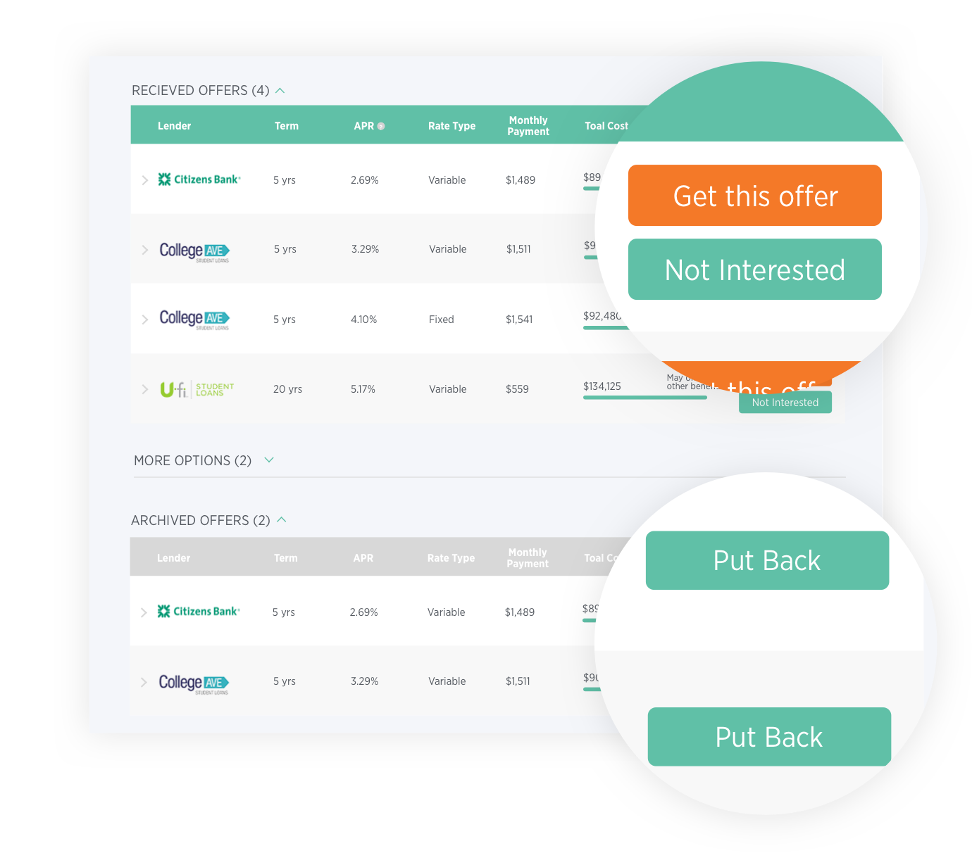
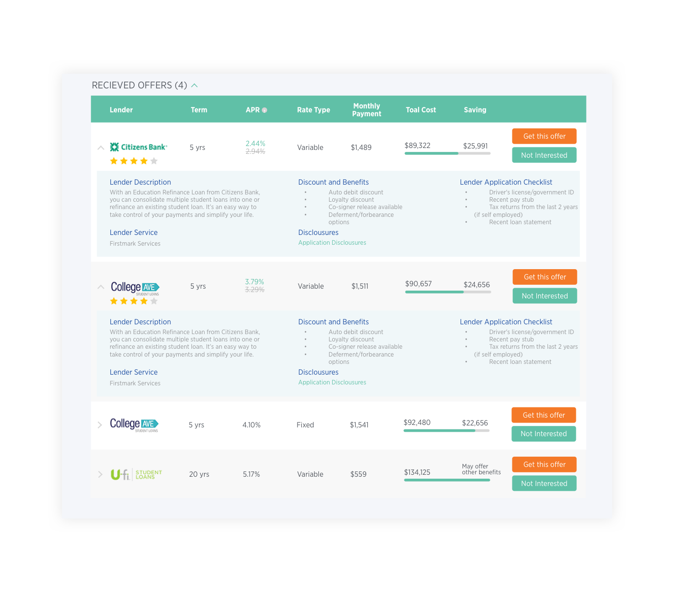
Compare options in viewport
One challenge here is providing detailed information about each offer, but also saving space of each offer. So that users can view and compare multiple offer details without scrolling up and down. I arranged information into sections and removed duplicated information with the filters to same move space.
Usability Testing
- The participant found the overall page structure clear and easy to navigate.
- The participant still had to think for a while about how to use "discount filter". He didn't understand what "apply discount" would do here before he applied it, nor what each option means before explanations.
- The participant liked that he can archive offers he doesn't like, but he felt the "not interested" button call too much attention.
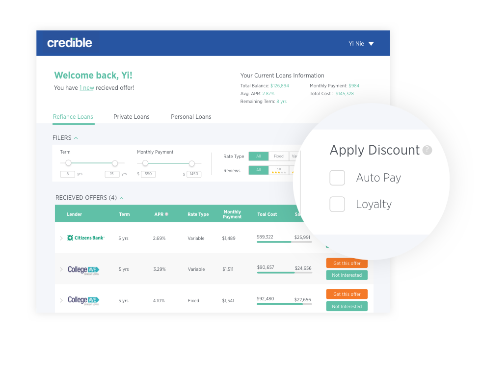
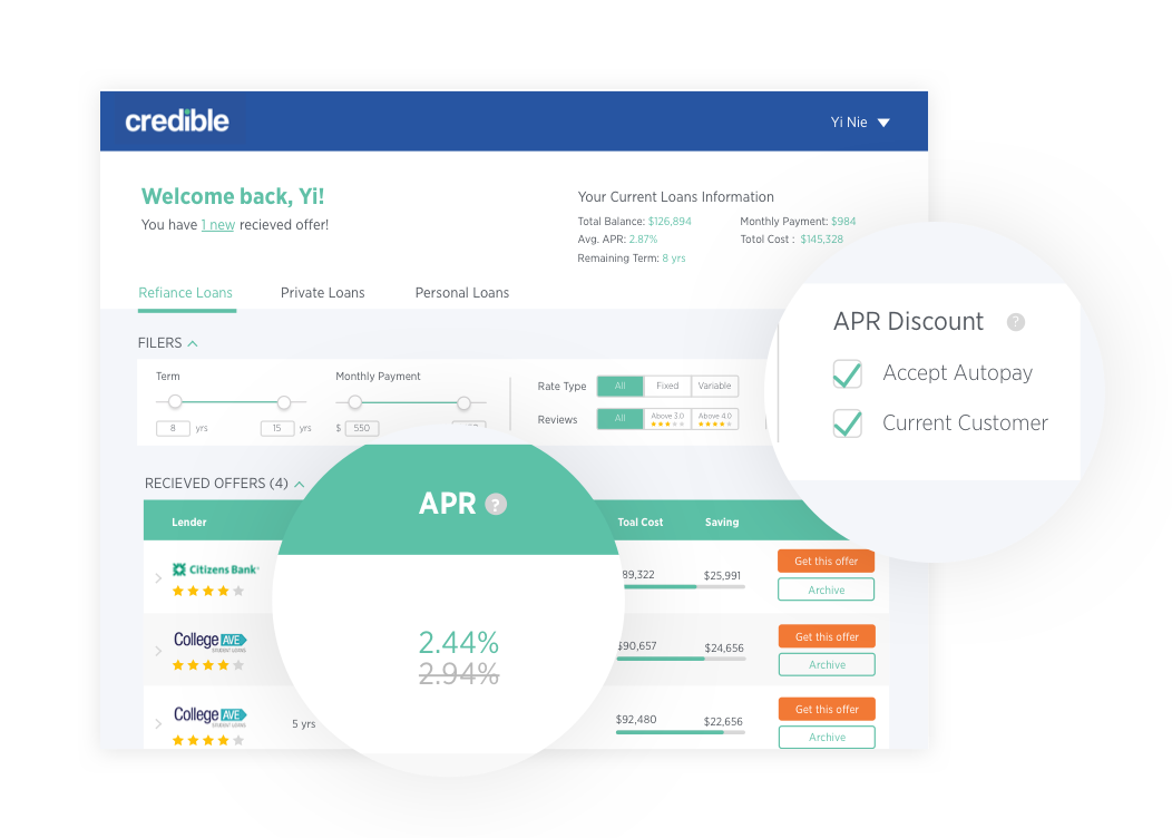
First, I changed the label "Apply discounts" to "APR discounts", so that users can understand what this filter is related to. Then I started to really think about users mental model - users would like to know possible discounts, then filter out if they don't meet requirements. So I decided to make the default to show both discounts, and users can un-check if they don't meet requirements.
Visual Design
I refined the visual of my design based on Credible's branding, to make it feel clean, modern, approachable and trustworthy.
The End
Whoo, this is a really long post, and this is not all of this project. There are some detailed interaction decisions I didn't cover on this page, but you can find them in the full document. This is only one of the small project when I was worked at Credible. If you are interested in more work, contact me to learn more!