Photo Management Mobile App
Viewing and organizing photos are not always easy. In this project, I designed a photo management mobile app to help users organize and view their photos in a better way.
Problem
The first brainstorming session of my process is always asking a lot of questions. Asking questions and analyze them can help me better understand the context and figure out next steps. On the other hand, asking a lot "why" questions helps me to better understand users needs and reframe research questions.
Questions I asked
- What do users want to achieve on mobile devices?
- What are the scenarios that users use photo management application on phone? Where and When?
- How do users manage their photos now?
- Do they use any similar products?
- What are their pain points that haven't been covered by current products?
Research questions
- What devices do you have to take and store photos?
- What kind of photos do you usually take?
- How do you manage your photos now?
- Do you use any photo management or editing application?
- Can you walk me through how you use these applications last time?
User Research
After six user interviews. I took notes on different colored sticky notes for each interview and organized them according to different functions of photo organizing application.
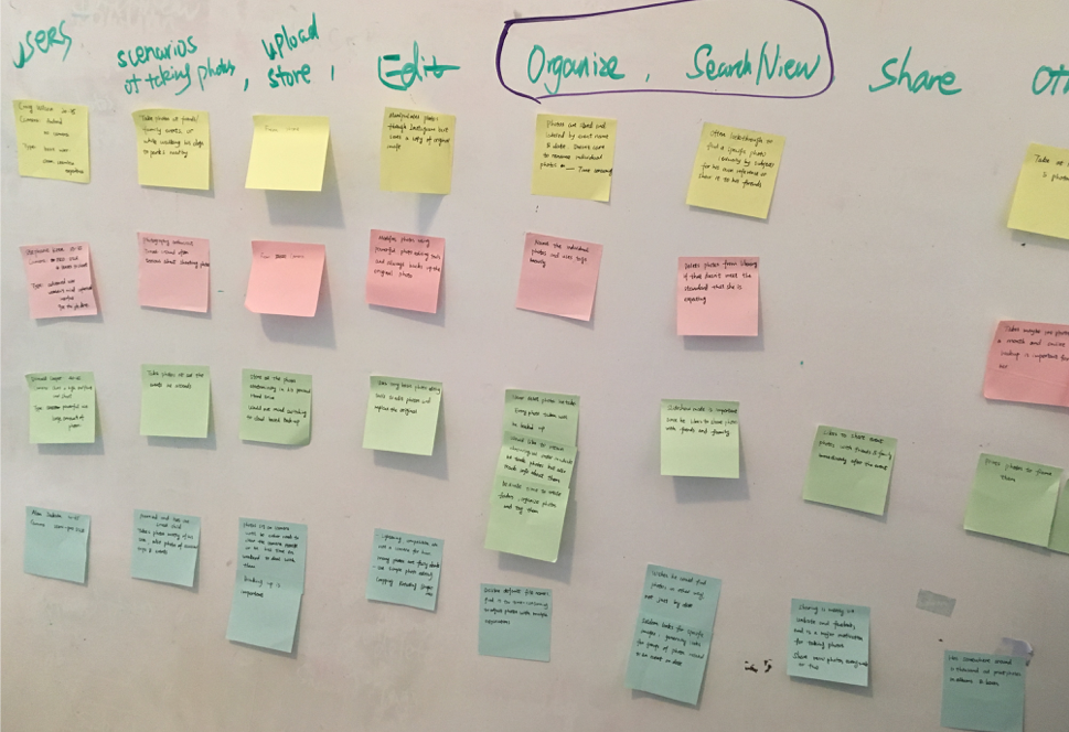
Affinity diagram of the interview notes helps me to better understand what is the main pain point and what are the different needs of different users. I found that the most common pain point is users need an efficient and effective way to organize and search photos but they all have different using context and motivations behind it.
Competitor Analysis
Competitive analysis helps me understand the current marketplace and what are the issues that these products didn't cover, then identify potential market opportunity. I chose Google Photo, Apple Photo, QuickPics, Slidebox according to online reviews. During the competitor Analysis, I tried these applications, listed out their main functions, mapped out their information architecture, took notes of their UI and IxD design.
Google Photos
iOS Photos
Slidebox
Quickpics
Positives:
- Auto back-up
- Image recognition: users are able to directly search subject in their photos
- Multiple ways to search: by places, by people, etc.
- Easy sharing: sharing via email, link, etc.
Negatives:
- Information architecture and tab labels are not clear enough
- Auto stylized photo and auto-classification are not accurate for pro users
- Only one way to view photos
Research Synthesis
After the interview notes analysis and competitor analysis, I synthesize all the information I had now, which can help me with initial ideation. Below are research insights and design guidelines.
Research insights
- Different users have different habit of viewing and finding their photos, such as by trip and by events
- Most users would like to do complex editing using third applications. They may do basic editing like rotate and crop in the photo management tool
- Most users like to share photos with others
- Sync and back-up of photos are important. Many users have more than one device
- How to organize photos efficiently is not well designed by most of the application but it is important for users
Design guidelines
- Provide different view modes according to different users' habits
- Provide basic edit tool instead of complex editing options
- Provide convenient and easy way to share
- Provide auto-sync and back-up between multiple devices
Ideation
Design goals and key consideration
Organizing efficiently
Viewing freely
Searching easily
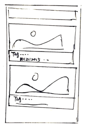
Timeline View
Pros: Photos are organized by events so that users can find view and share with friends easier
Cons: Can't view every photo with one glance
Device categories
Pros: It's easier for users who have multiple devices to organize their photos
Cons: Not useful for user who owns one device
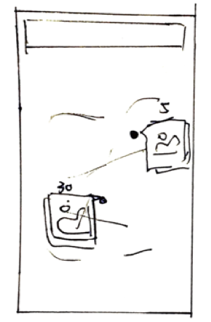
One Photo One Line
Pros: Users can view their photos without tapping on pics, integrate gesture for quick interaction
Cons: Can only view a few photos at one time
Map View
Pros: Photos are organized in map view providing better experience for users who like traveling
Cons: Can't view every photo with one glance
Time Order
Pros: Users are familiar with the UI pattern. they can find photos via time
Cons: Hard to find photos for user who took a lot of photos
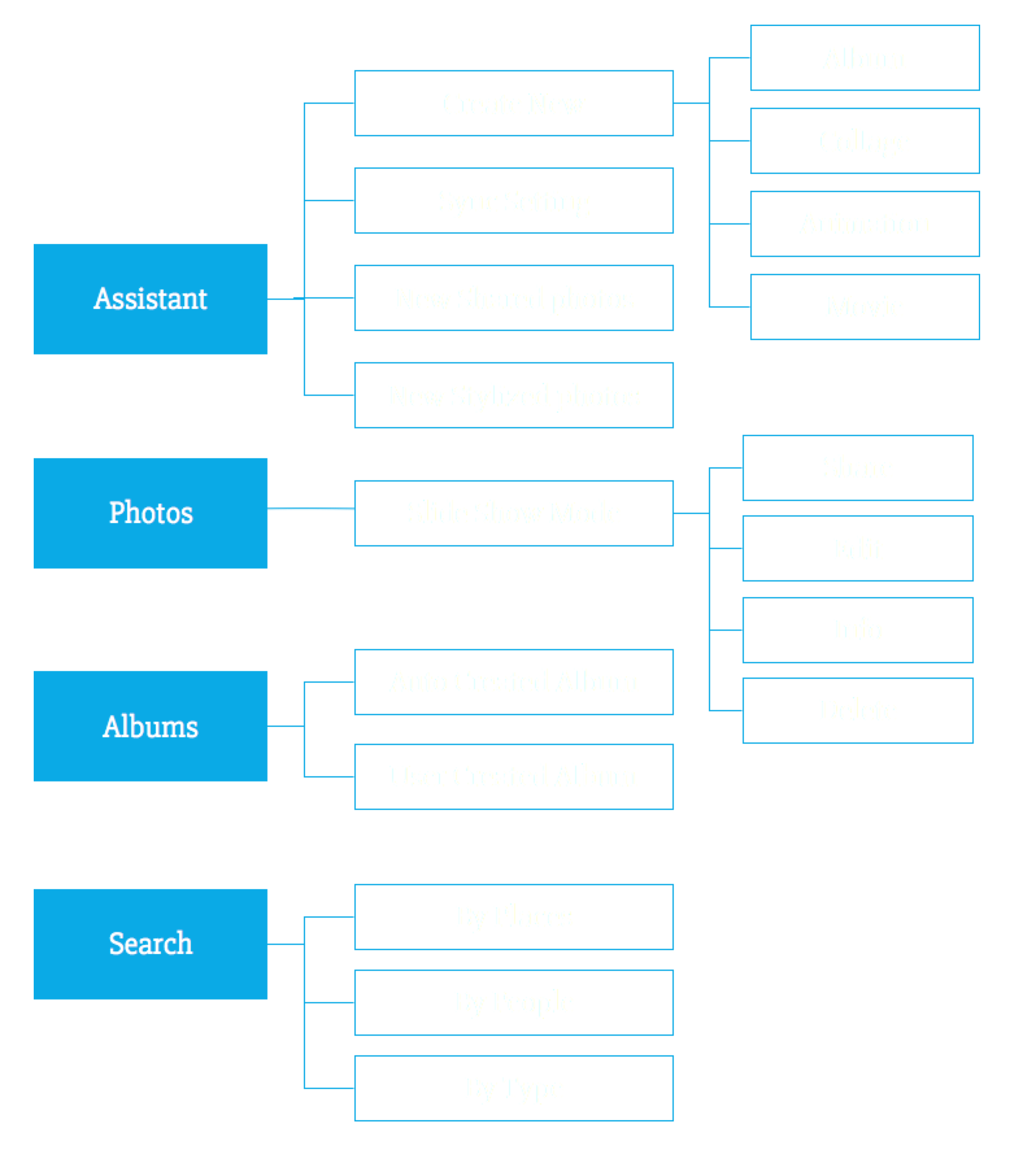
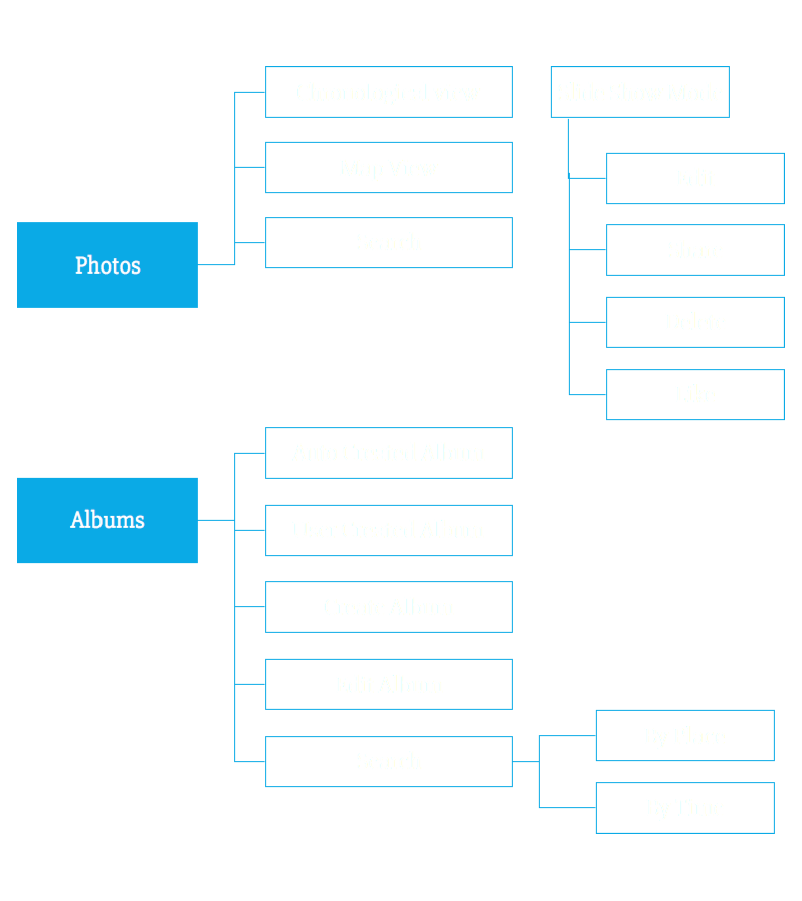
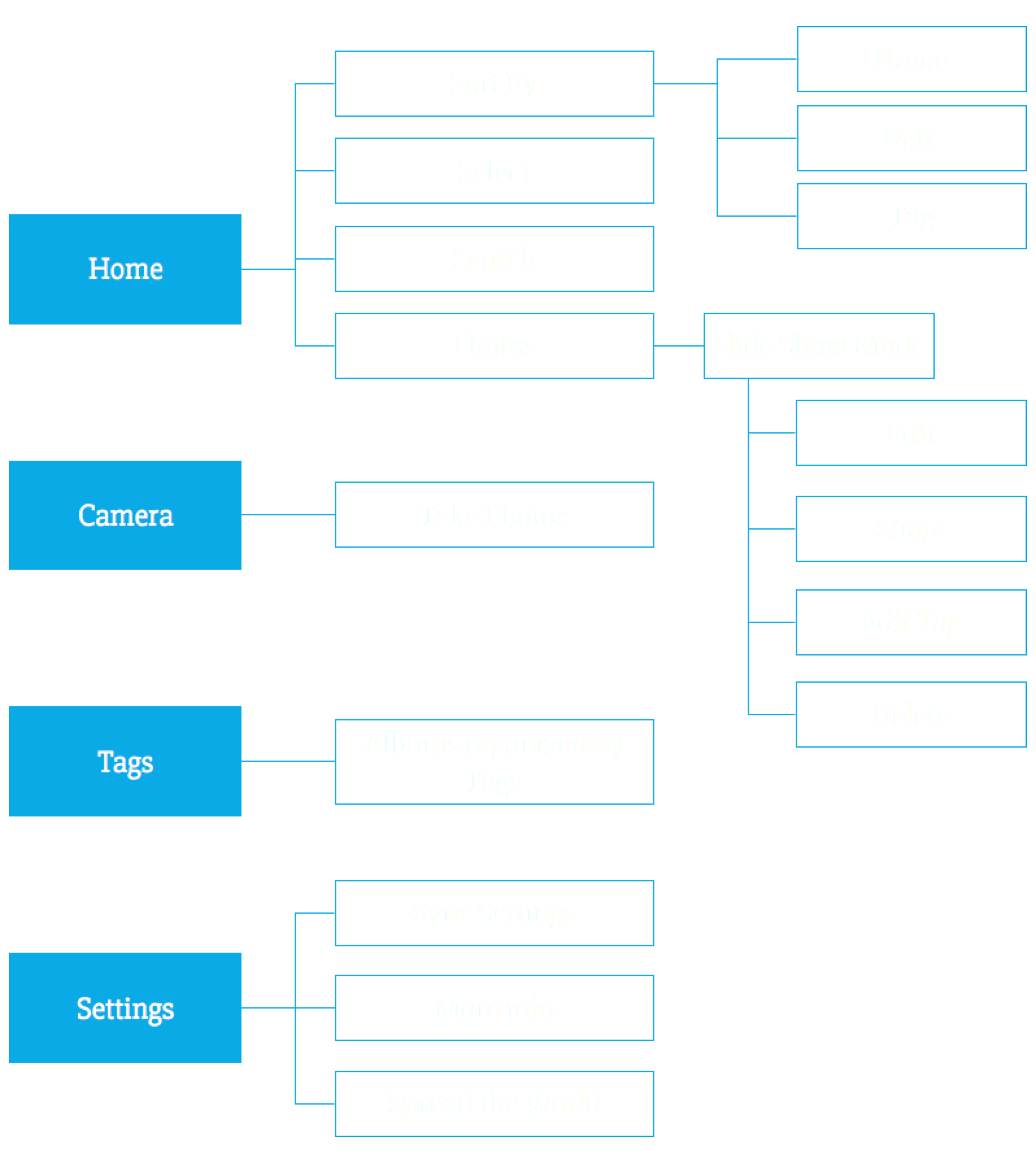
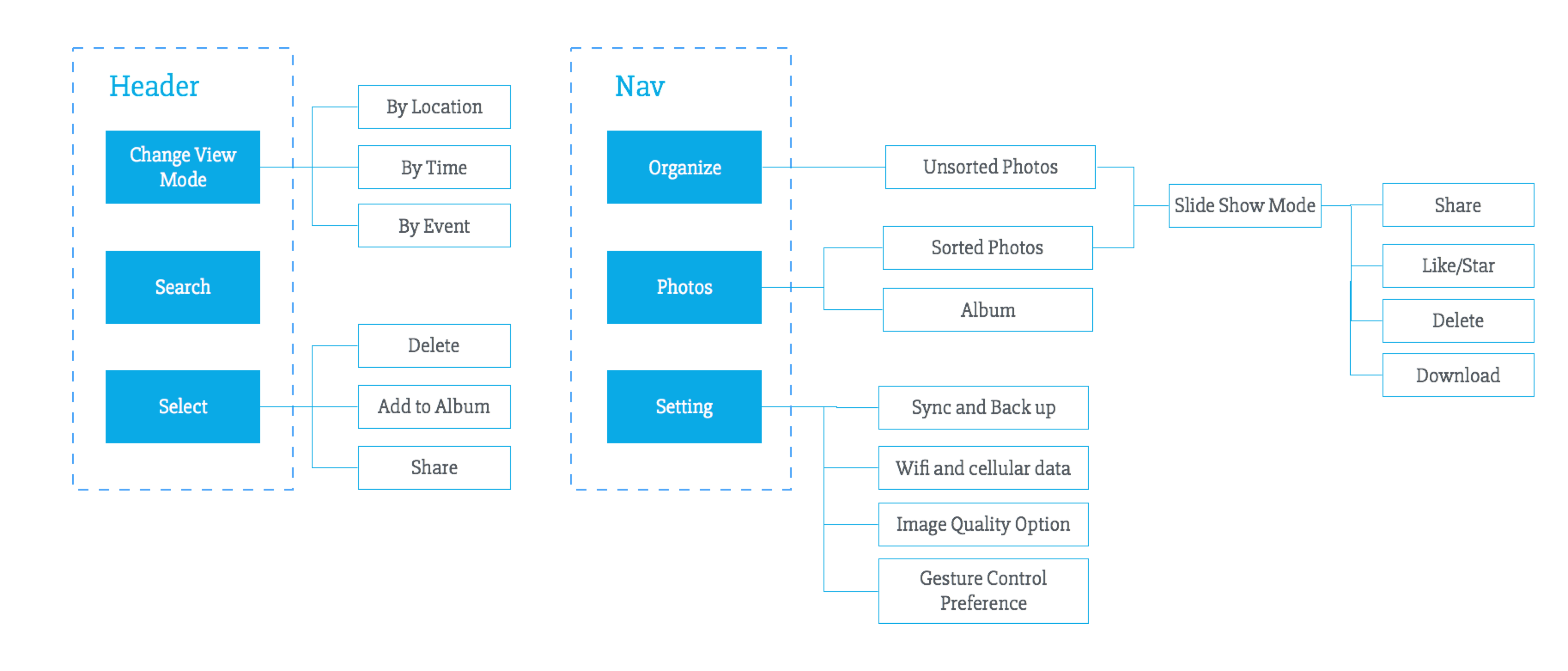
Information Architecture
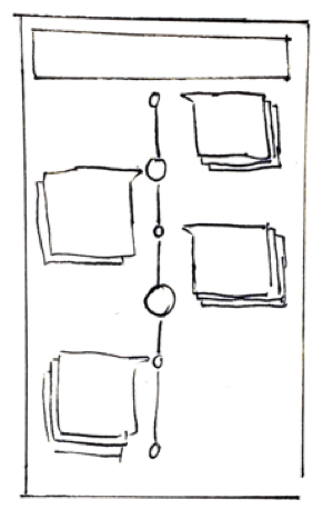
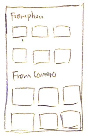
With these ideas in mind, I started to consider how these ideas can fit into the system. I created three different information architecture and sketched out key screens. In this way, I'm able to see how the ideas I came up can fit into different IA and what are the pros and cons of different structures. Then I made paper prototypes and conducted usability tests.
Design Details
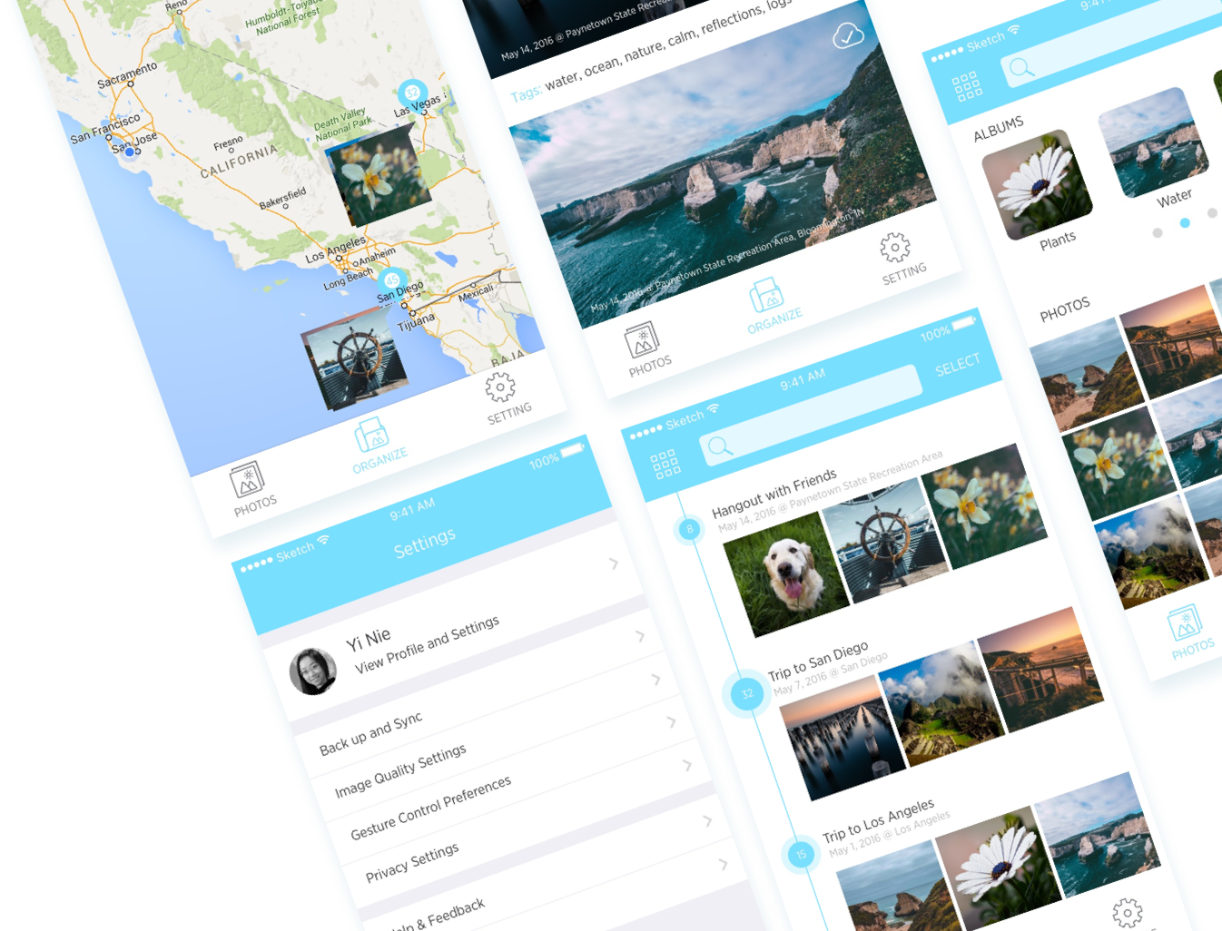
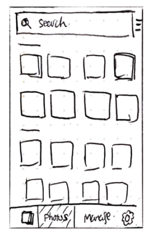
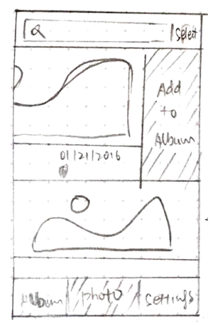
Different view modes to meet different users' needs. The application can provide five different views for different user needs. The default comfortable view, traditional grid view, map view for travelers and event view for users who took photos during events.
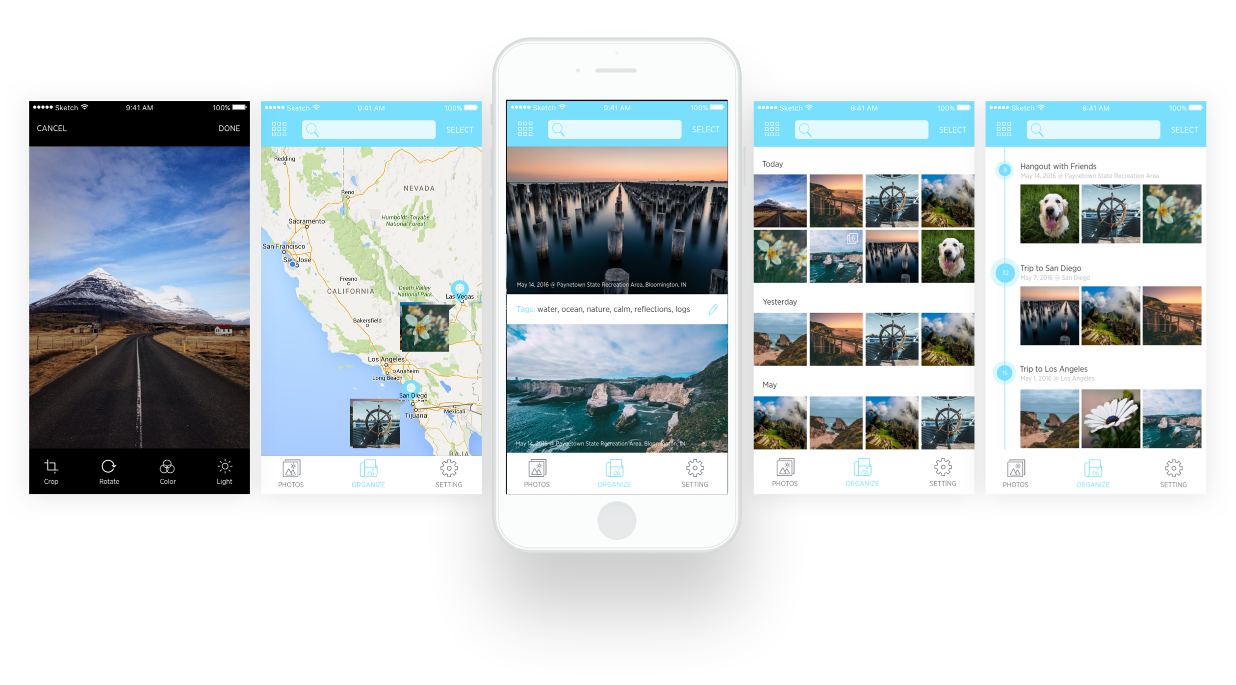
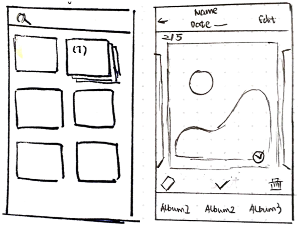
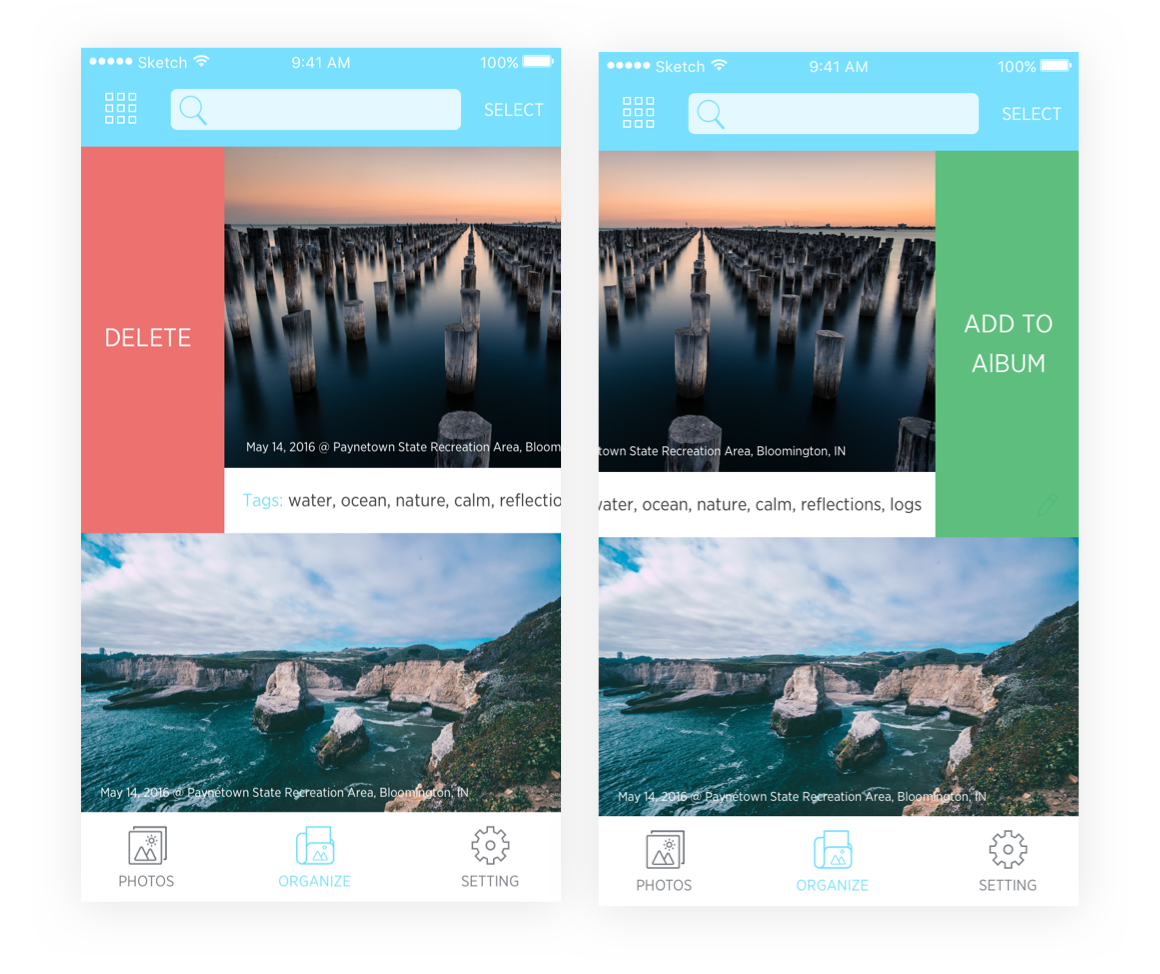
Photo organization on your swipe
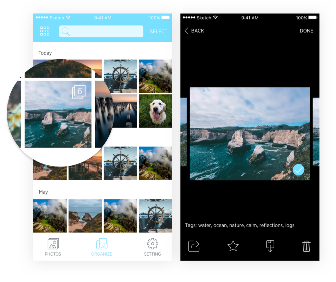
Use swipe and long press to delete and select photo so that users don't need to enter the slideshow mode. Users also have the flexibility to customize their own gesture preference to boost their own flow.
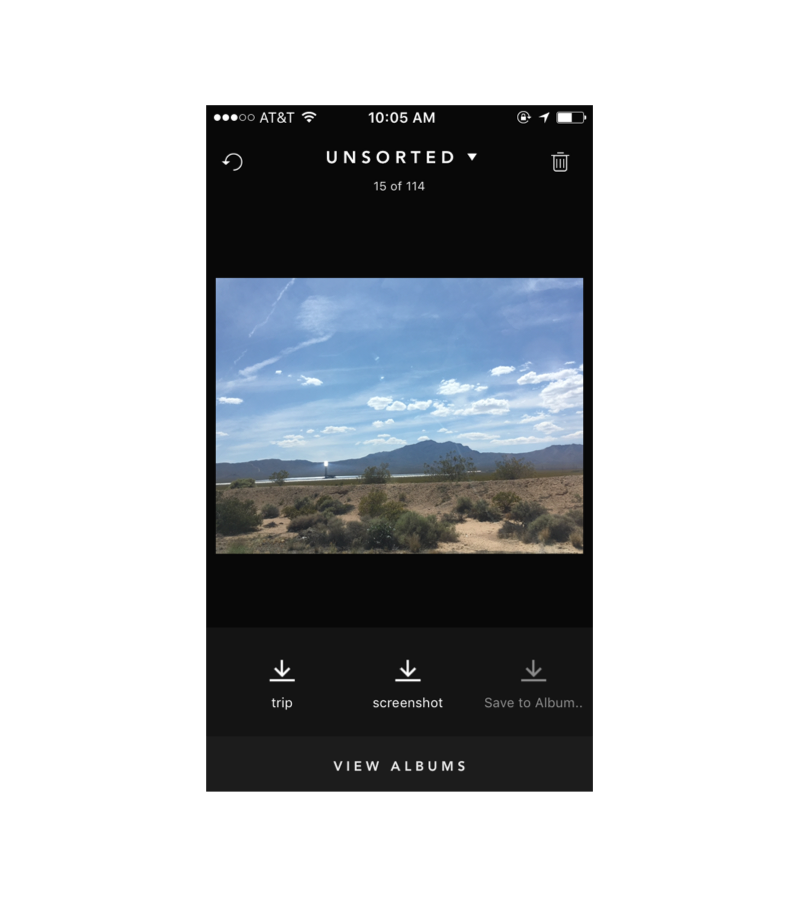
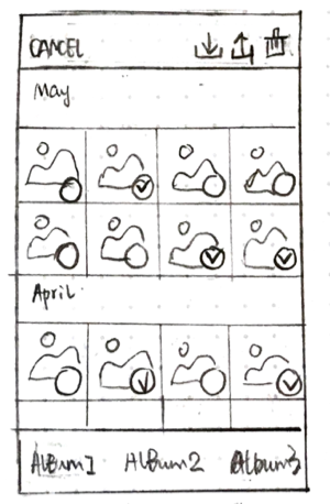
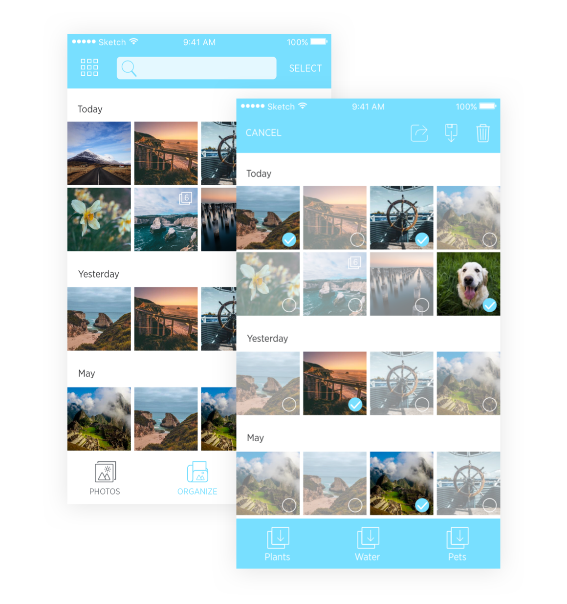
Multiple photos selecting and organizing
Grid View is efficient when organizing several photos together. In select mode, users can select multiple photos, share, download, and delete at one time. Existing albums will display at the bottom of the page so that users can add these photos into albums at one time.
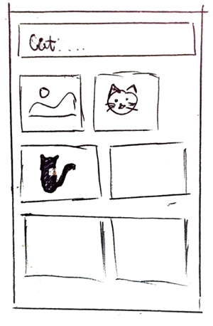
Batching similar photos
From user research, some users like to take several pictures at one time and select one or two from them. The "batch" feature can help them do it efficiently. The similar photos will be combined and users can select one or two then tap "Done". The selected picture will be saved and other picture will be deleted.
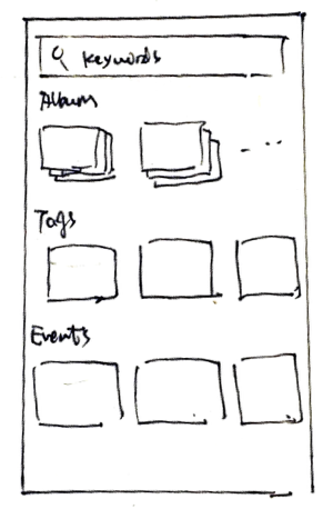
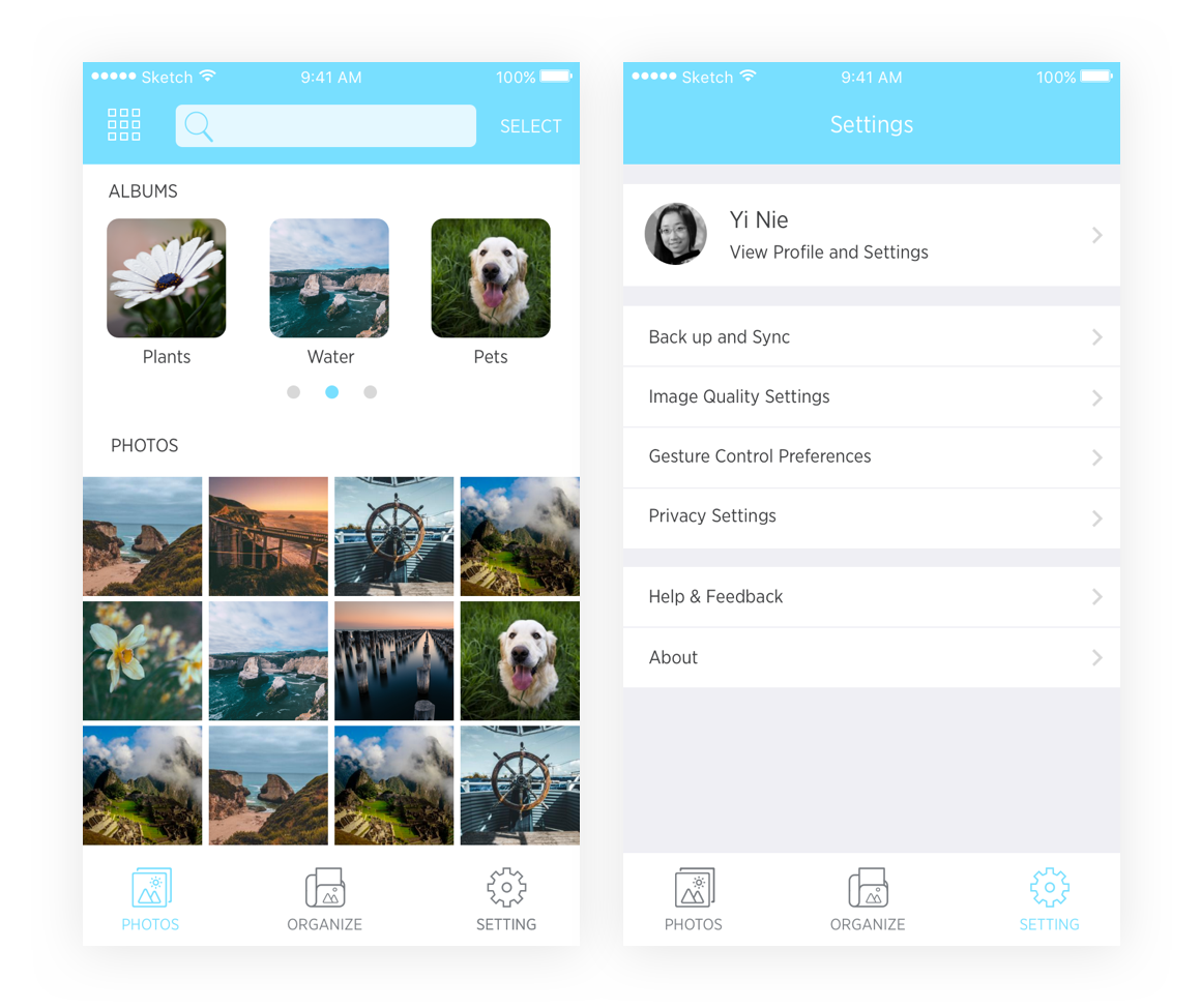
Photos tab and settings tab
In the photos tab, users can view all the photos and albums. In the settings page, users can set up whether they want to use cellular data to back up photos. Considering some photos are taken by DSLR and file size is large, users can set the image quality to view on mobile, which can influence the usage of cellular data and loading speed. Users can also set their own gesture preferences.
The End
There are still some details I didn't show here. If you are interested, check the full document here or try the prototype.