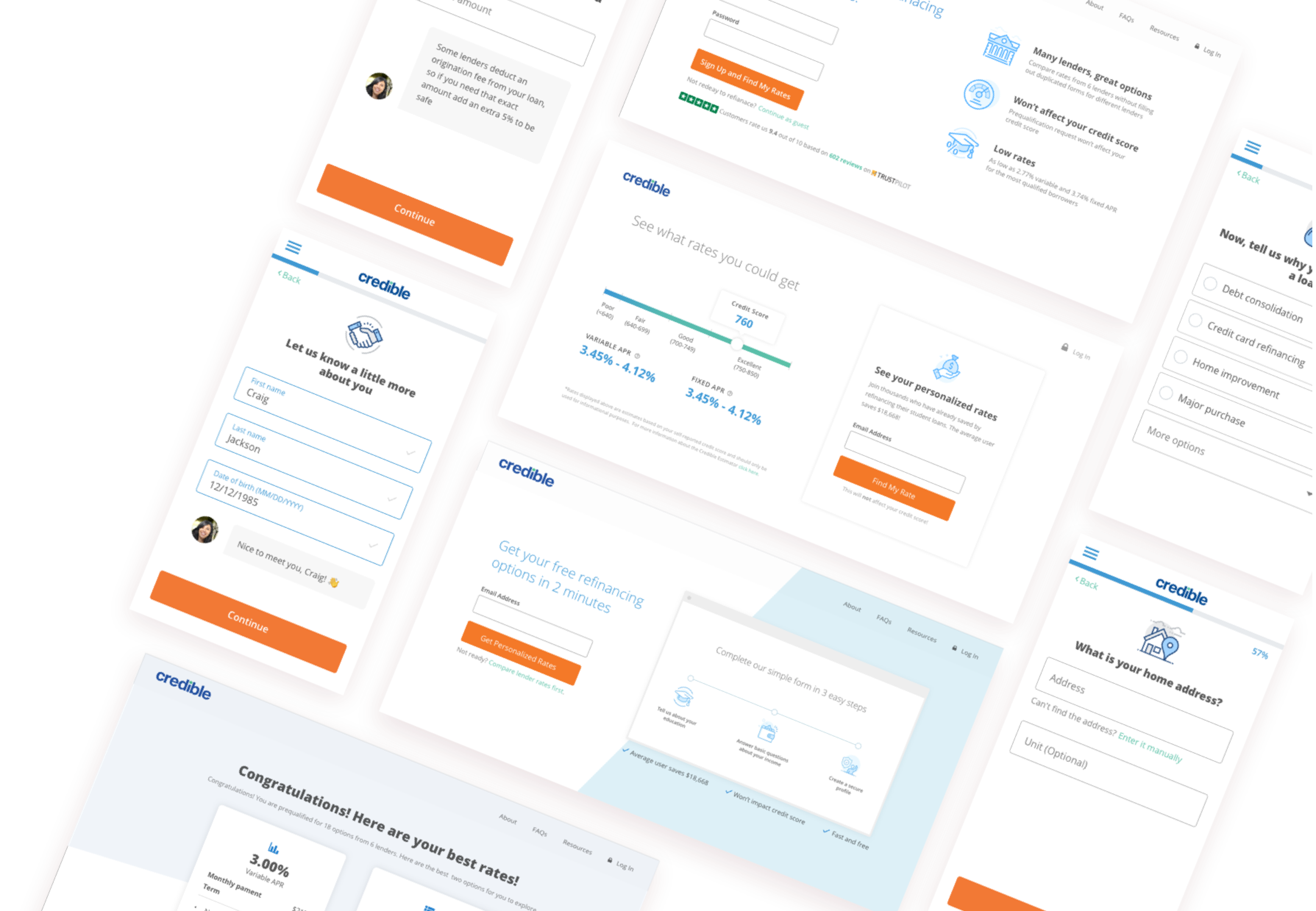
Loan Application form A/B testing
Led the design of 3 around a/b testing of Credible’s loan pre-qualification form.
The content of this project is hidden because of NDA. Please contact me for the password.
Led the design of 3 around a/b testing of Credible’s loan pre-qualification form.
The content of this project is hidden because of NDA. Please contact me for the password.
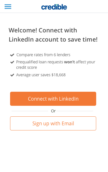
Credible is a marketplace for student loans, student loan refinancing, and personal loan. We help borrowers compare personalized and accurate rates from multiple lenders so that borrowers can choose the one that best fits their need.
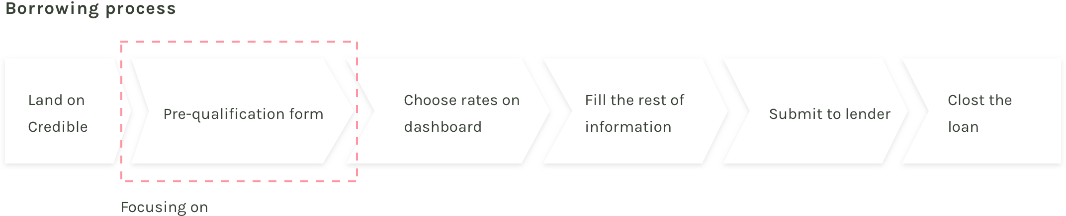
Borrowers land on Credible, finish the pre-qualification form and they will be able to see their rates on dashboards. Then borrowers pick one offer, finish up the rest of the information lenders need. Finally, they will be able to submit their loan request to lenders.
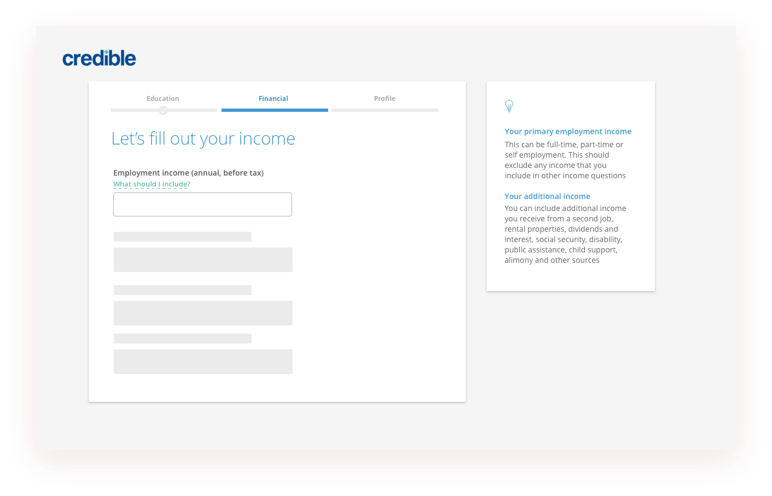
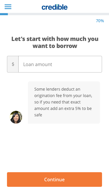
Pre-qualification form is an important part of the whole process and this project is mostly focusing on pre-qualification form.
Before I started, it’s important to understand the problem and make sure all the stakeholders are aligned on the same goal. So I talked to the product manager, loan operation and client success team and listed out the following design success metrics.
Conversation data from Google Analytics reveals that there is a large drop off on the first step and third step. To better understand users’ behavior and pain points, I conducted user testing on the old prequalification form.
The important part of A/B testing is to define the hypothesis so that we can control the baseline and test variation to make sure we can confidently learn from these experiments. Based on our user research insights, I came out with concepts and hypothesis to test:
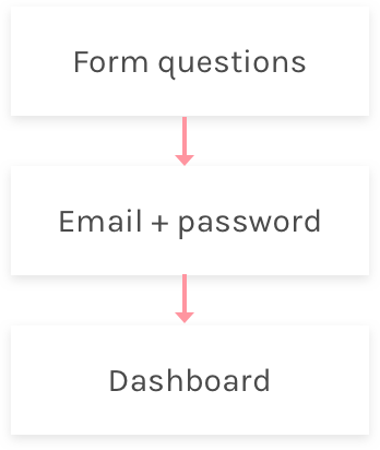
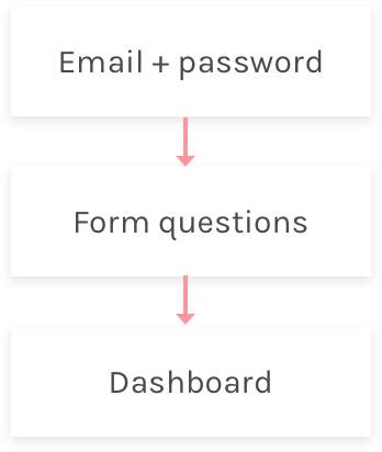
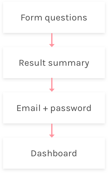
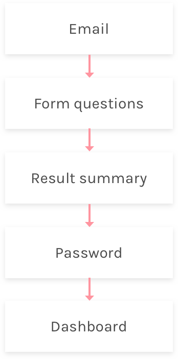
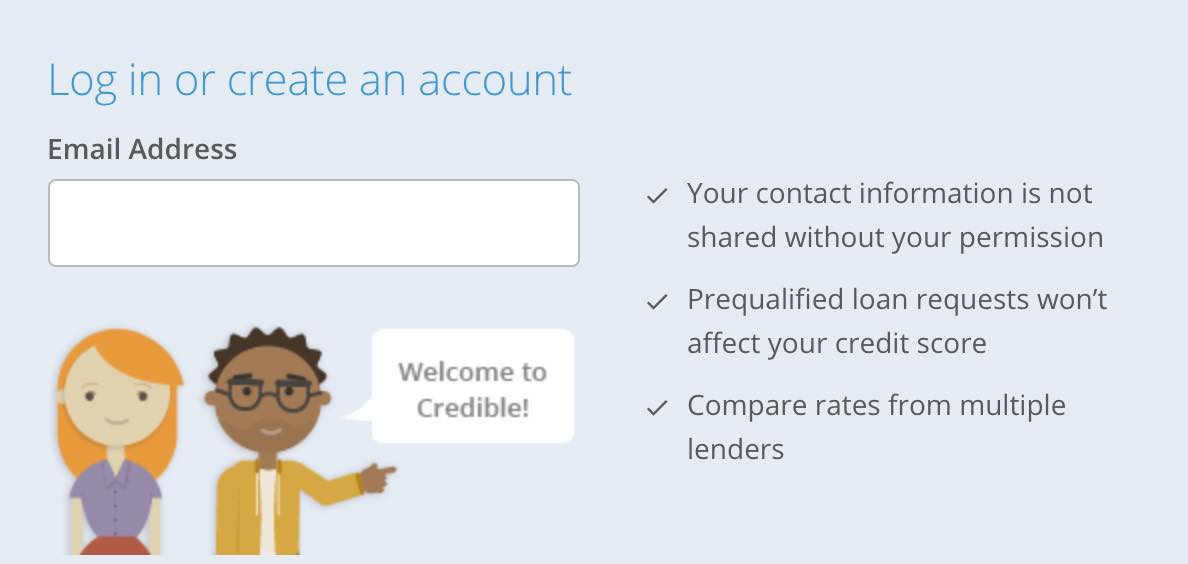
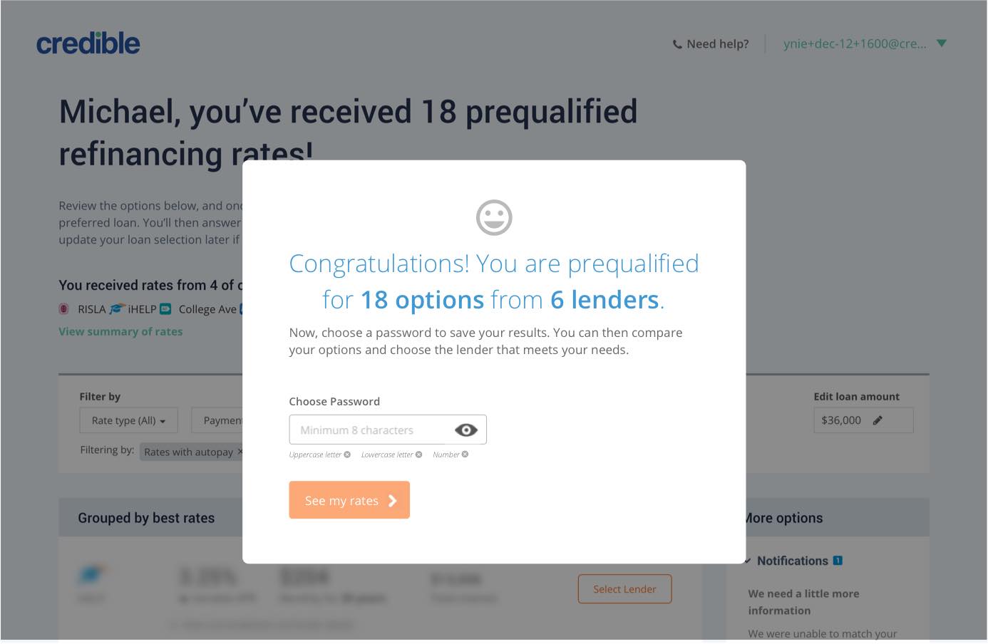
I learned from user research that creating accounts is the biggest friction of the whole process. But having an account is necessary because users will need this to access their rates and finalize the loan with lenders. My first hypothesis is that different flow of creating accounts will impact user’s perception of the process and impact conversion. Here are several options I’ve explored.
Create account at end of form
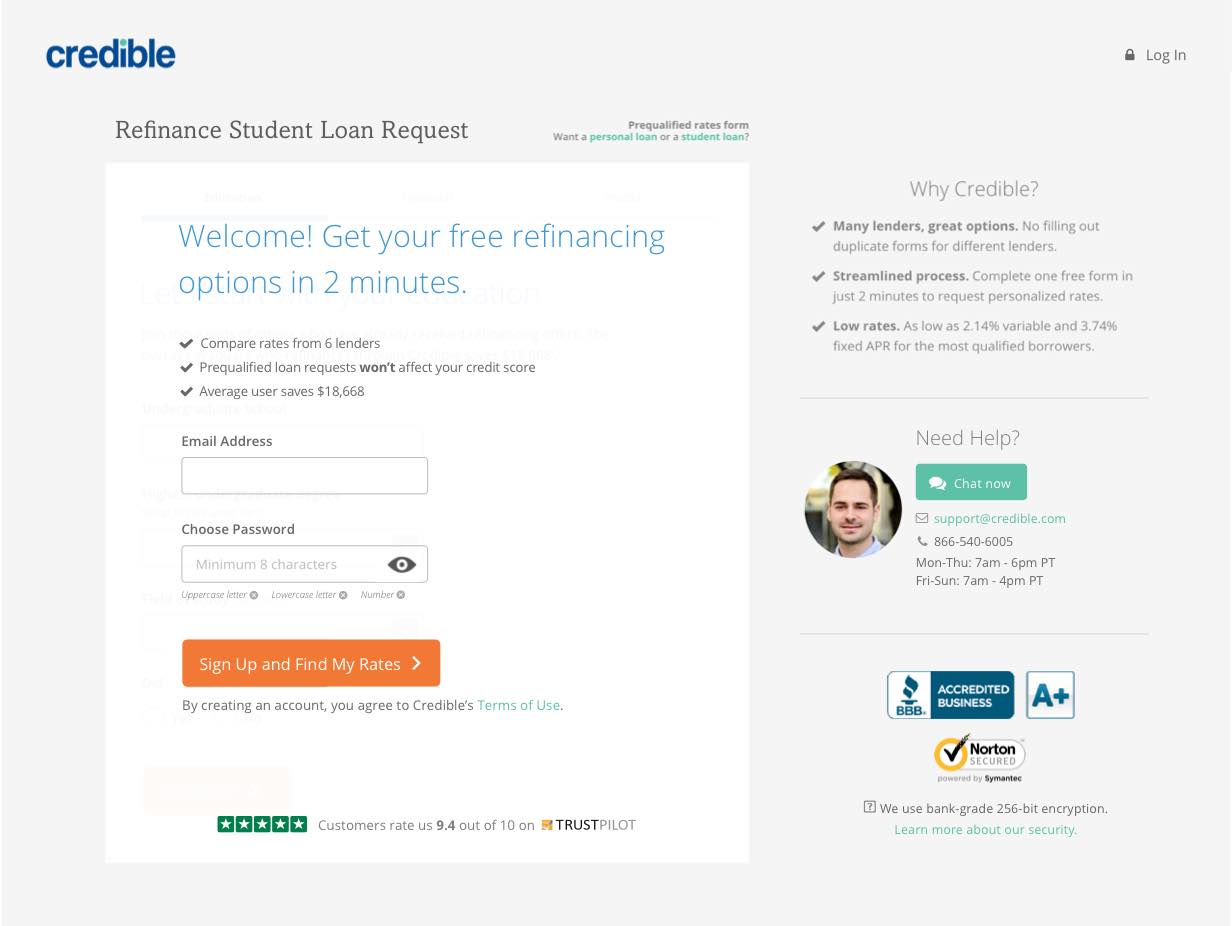
Create account at beginning
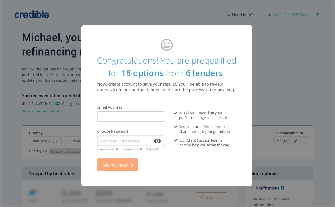
Create account after result summary
Separate email and password
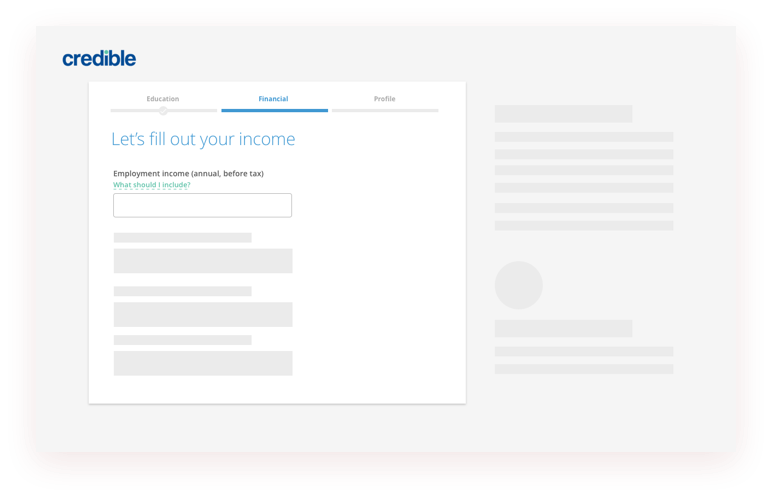
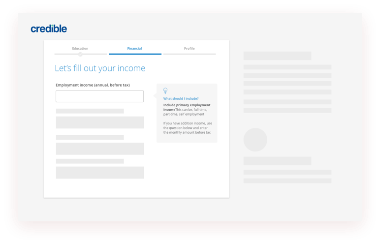
Users had difficulties answering questions like income, housing payment etc. This may add extra friction to finish the process. Though users in the user testing click the tooltip to get more information, in real life users may not discover the tooltip and abandon. Our second hypothesis is that surfacing helper content will streamline the process and reduce drop off.
Click tooltip to open help content
Focus on field to reveal help content
Surface tooltip on right column
The form’s look and feel makes users feel standard and straightforward. But users had the mindset of being asked personal information, which is kind of a negative subconscious. So what if we can make the form look less like a form and bring more humanized into it? Below are the two concept prototypes I’ve made.
Nature language form
Conversational form
One of the challenges we have is that, in order to track different designs impact around the full funnel, the traffic on Credible is not large enough to run multiple ab testing at the same time. So we have to select one direction and run only 2 to 3 testing at the same time to confidently test the hypothesis. We ranked these three directions based on impact and effort. We choose to test the create account flow because we believe it will have the highest impact with relative low implementation efforts.
In the current design, we try to push the difficult part to the end of form so that user will start easily and make through the end with momentum. But we are still seeing a lot of drop-off at the create account step.
Creating accounts first will definitely cause a lot of drop-off at the very beginning. But on the other hand, by revealing the most sensitive information at the front, this will filter out low intent users and improve the conversion later in the process.
Give user tease of the result will motivate users to create accounts. For users who receive rates, give users a tease of how many options they have got and overlay the modal on their dashboards. But for users who didn’t receive any rates, we don’t want to mislead them so the main message is “Your result is ready” and it won’t be an overlay of the dashboard.
The hypothesis here is that separating email and password will reduce the feeling of creating accounts so that user feel this is less friction.
The experiment has been running for about 1 months to make sure we have enough data and draw the conclusion without bias.
The 1st round experiment has set up a good foundation for us. The data reveals that on creating account page, there is a large amount of drop off, but after creating accounts, there are very few users abandon the form. So it’s clear that the biggest opportunity is how can get more low intend users filling the form and checking their rates.
The testing result from the first iteration also reveals that what really bothers users is not creating accounts, we need to dip deeper to learn the reason behind that. So I did more depth interview with users. The real insight comes after I asked several why.
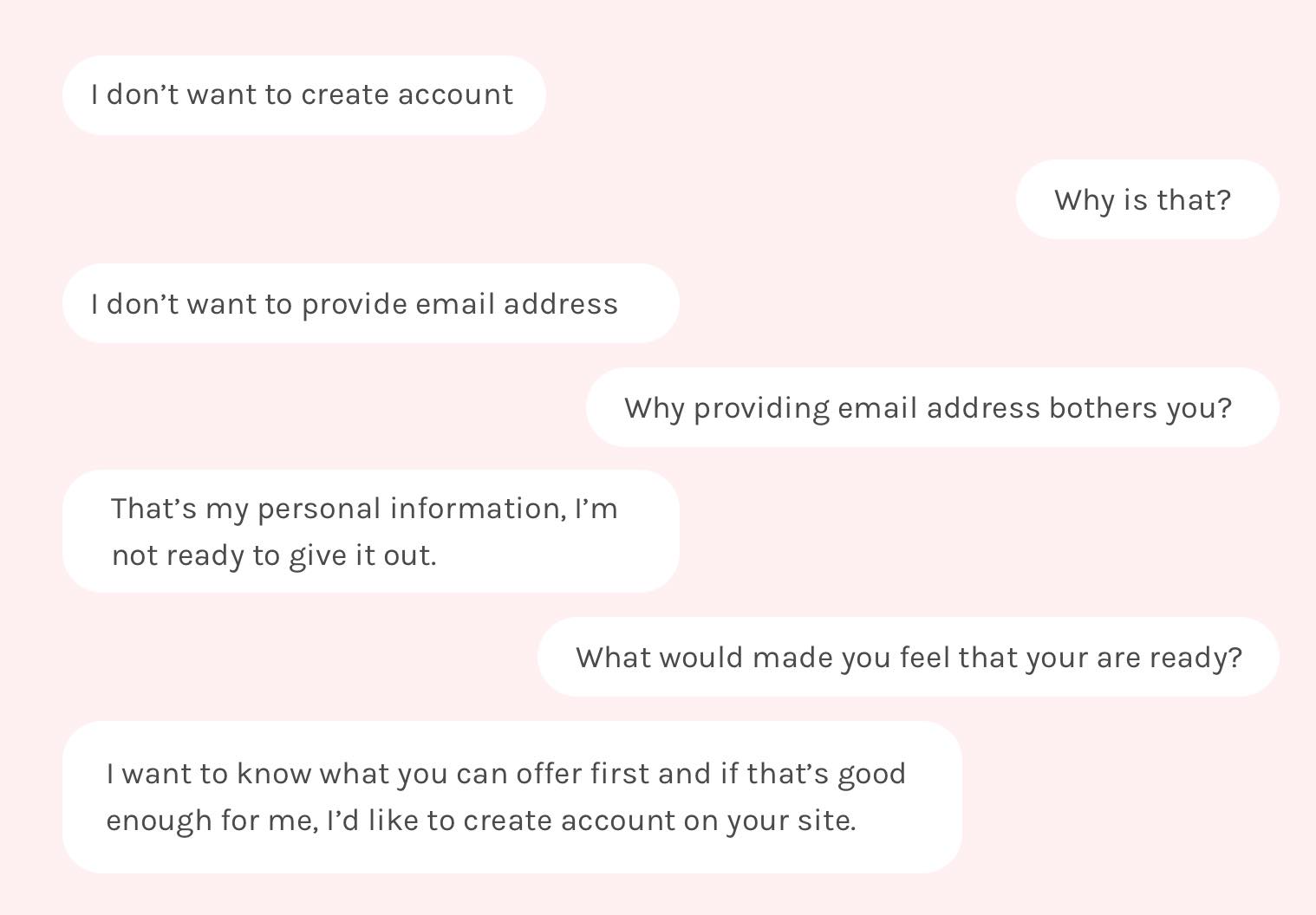
The user research reveals the real friction of creating accounts is that we are asking user their personal/private information without offering them any value. Users don’t have any idea of what’s going happen next and what they can get.
Based on user research the primary problem we are trying to address is to build trust with users through bringing more transparency.
Same reason as mentioned above, now we need to choose directions we want to test. Since the improvements are all focusing on create account page, efforts to implement the design are about the same, this time I did internal concept testing. With the testing, I asked participants to rank different concepts based on the helpfulness. Concept 5 and concept 3 get the highest ranking. Below is the summary of this concept evaluation:
Participants like it's straightforward but value prompt is too vague and doesn’t resonate with them
Participants think social proof is important but they prefer reviews from the third party. Participant won’t trust testimonials.
Participants find it’s very helpful to understand the process, the video makes it easier to understand
Participants like that they can know what lenders are on our platform but the information is too generic
Participants all feel this is really helpful to get an estimated range before jumping into creating accounts they indicated that if the rates are good they are more likely to sign up.
After the internal testing, I decided to move forward with the video walkthrough concept and the rate estimator concept. It’s time to push the details. I did several iterations to make sure users can understand how to use it.
(Option 5 from previous step)
Design with real content and data
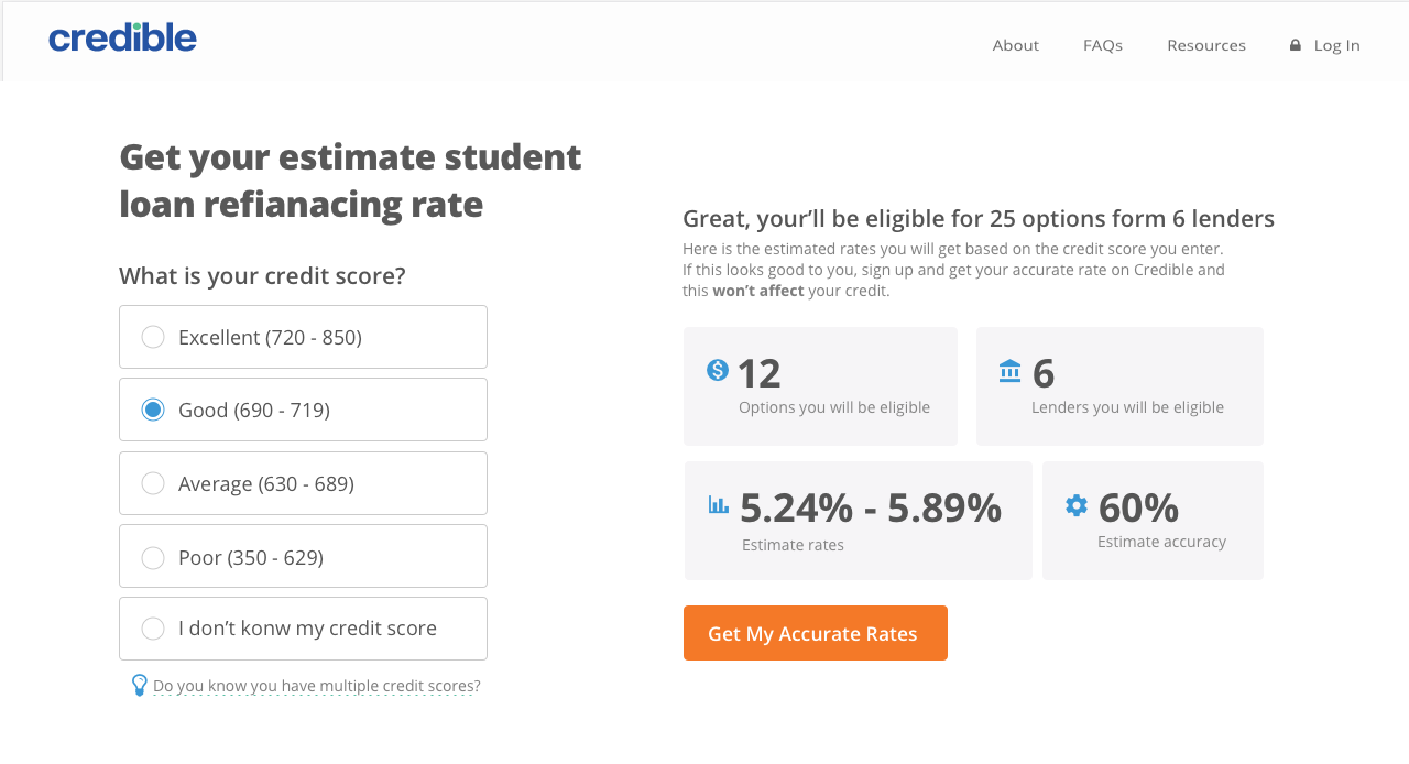
Rate chart add too much cognitive load
1. Credit score section took too much space. 2. Too much number to process
Use red on poor credit score bad may give user negative feeling
Users indicated they don’t know the slider is interactive
This variation features a quick walkthrough video of our process up to a dashboard. The hypothesis was that showing users our simple process would help users know what to expect, and therefore make the process feel known and simple.
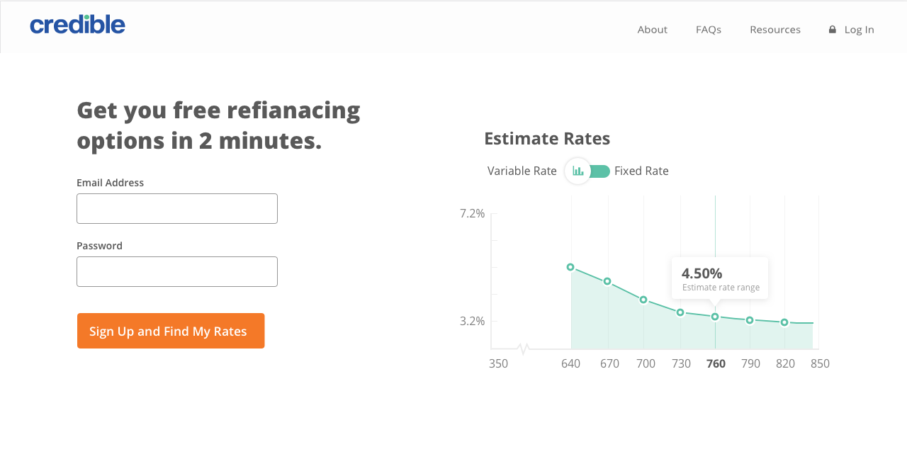
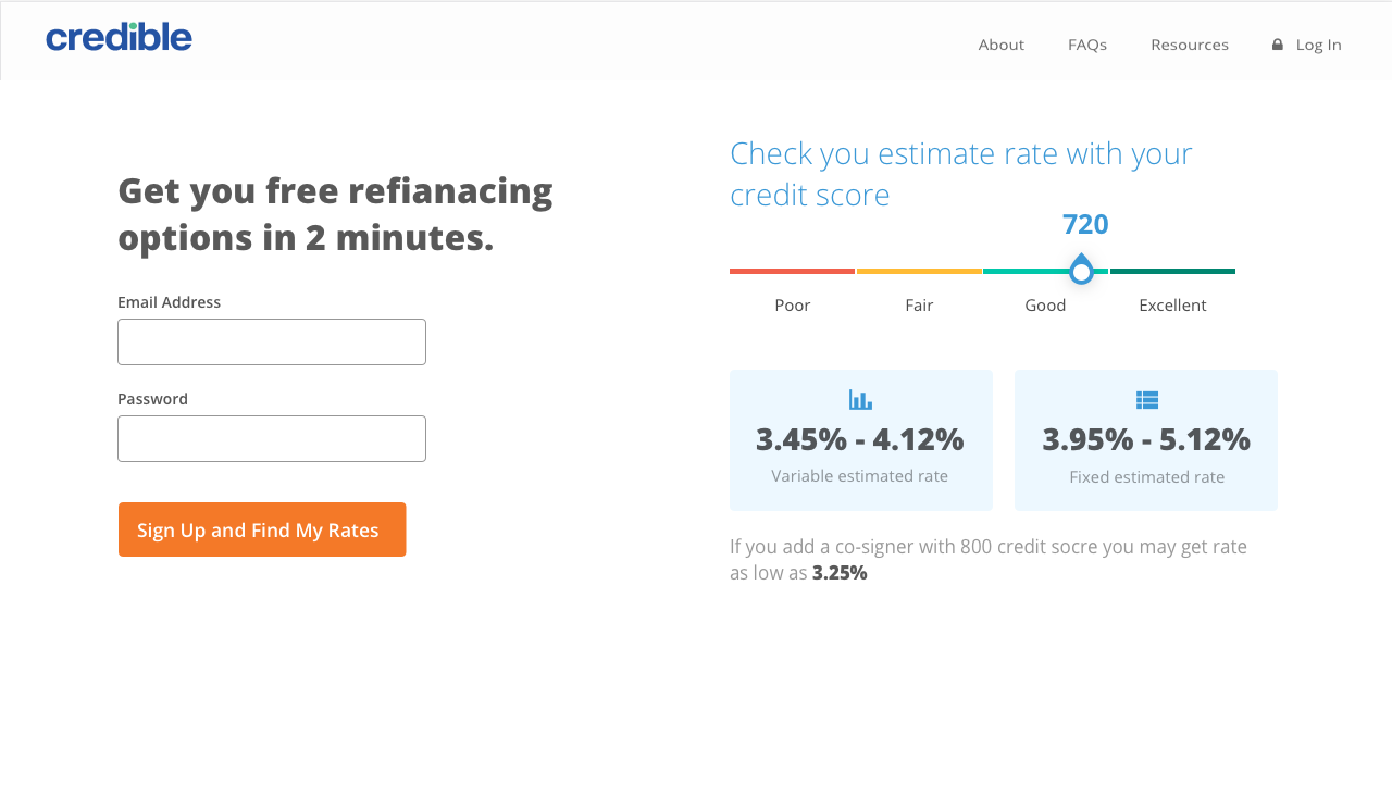
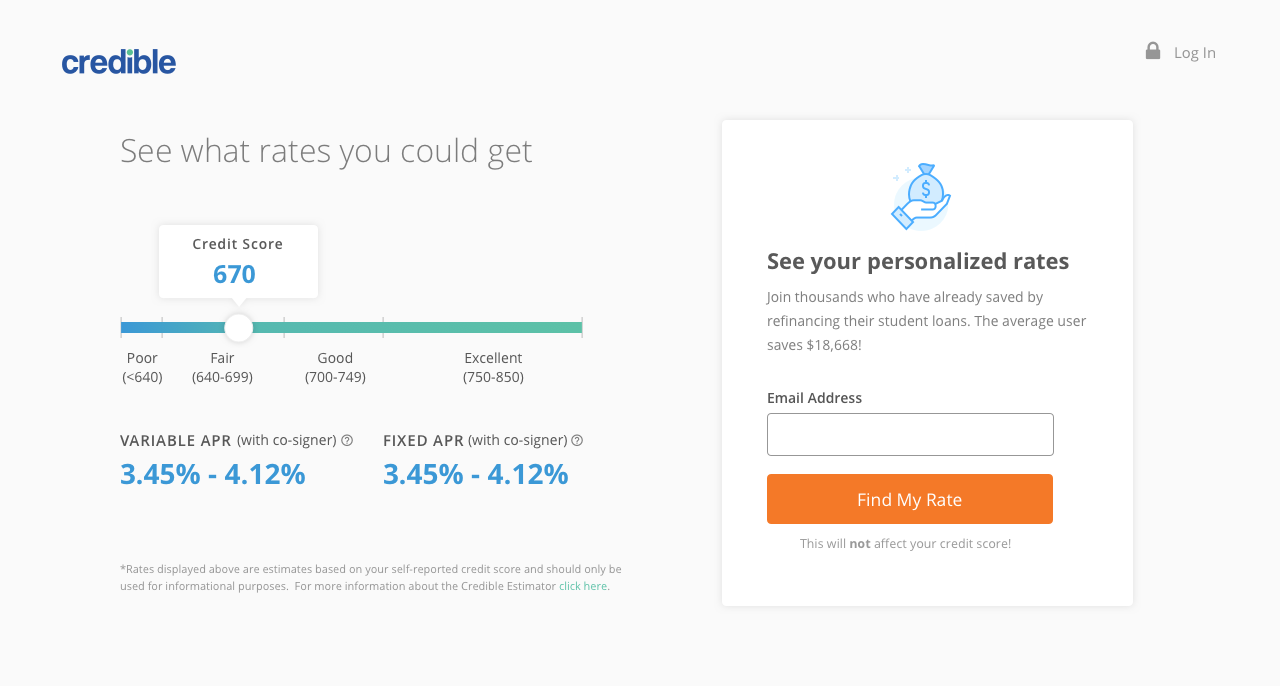
This variation aims to see if showing potential rates would, in fact, increase sign-ups and overall conversion. This variation features an interactive slider where users can estimate their credit score (by 10 point increments), and we will display the lowest possible rate across lenders.
The loan application is a complex thing that not a lot of people will expect to finish on your phone. However, in 2017 Credible’s mobile traffic start to ramp up and exceed desktop traffic but the form conversion rate on mobile is pretty low. So it’s time to put more investment on mobile and improve the experience on mobile.
In order to understand the pain points and frictions on mobile, I did a usability test on the old mobile form. Here are the key insights:
Based on the explorations I did on first round. , here are the approaches we can make form filling more efficient:
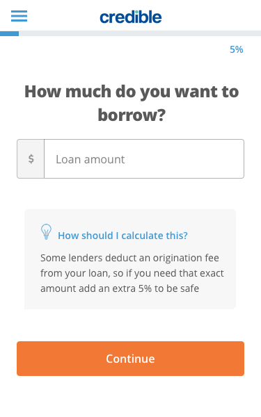
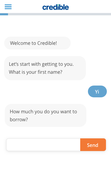
I came up with 3 options: the chat UI, one question per step and linking to other social network to prefill information. In order to pick the which option we are going to implement, we listed out how each concept would solve the problem and how difficult it is to implement and decide to move forward with one question per page option first.
Easy
Medium
Hard
One of the issues I didn’t address is to humanize the form to give users a more positive feeling. So I changed the tooltip to a Client Success Specialist explaining how to feel the form.
I tested the prototype above, it successfully reduced the back and forth scrolling. But I still found that all the drop-down fields still requires multiple taps. In order to simplify this part, I changed the drop-down fields to multiple selection fields.
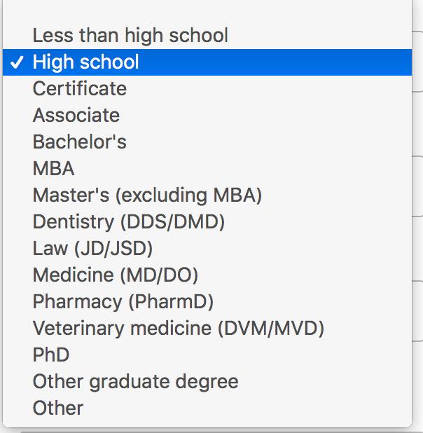
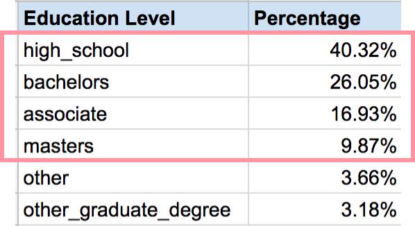
The challenge here is that if the selection has more than five options, what should we do? The product manager helped me analysis the option selection data. We found out that the first four selected options cover 93.17% of our users. So the solution is to surface the top four selected options and hide other options in “Other”.
The last iteration is to add more delight to the design and make the look and feel more friendly for our users. So I added icons on every page and animations on some key pages.

We tested the final one question per page design with old design (baseline). Below is the two design’s overall flow.